Updated September 03, 2020

This session

In this session you will be introduced to:

  1. The purpose of data visualization
  2. A framework of elements of data visualization
  3. Basic types of visualization
  4. How to choose the right visualization depending on:
    • Variable type
    • Amount of variables
    • Types of properties/relationships to be highlighted

Introduction to Visualization

DataViz

“The mapping of variable values/properties in the data to visually comprehensible graphical elements/positions”

Daniel

Purpose of Visualization

  • Explore properties of the data
  • Reveal insights to be found in the data
  • Create data-narratives
  • …

DataViz matters

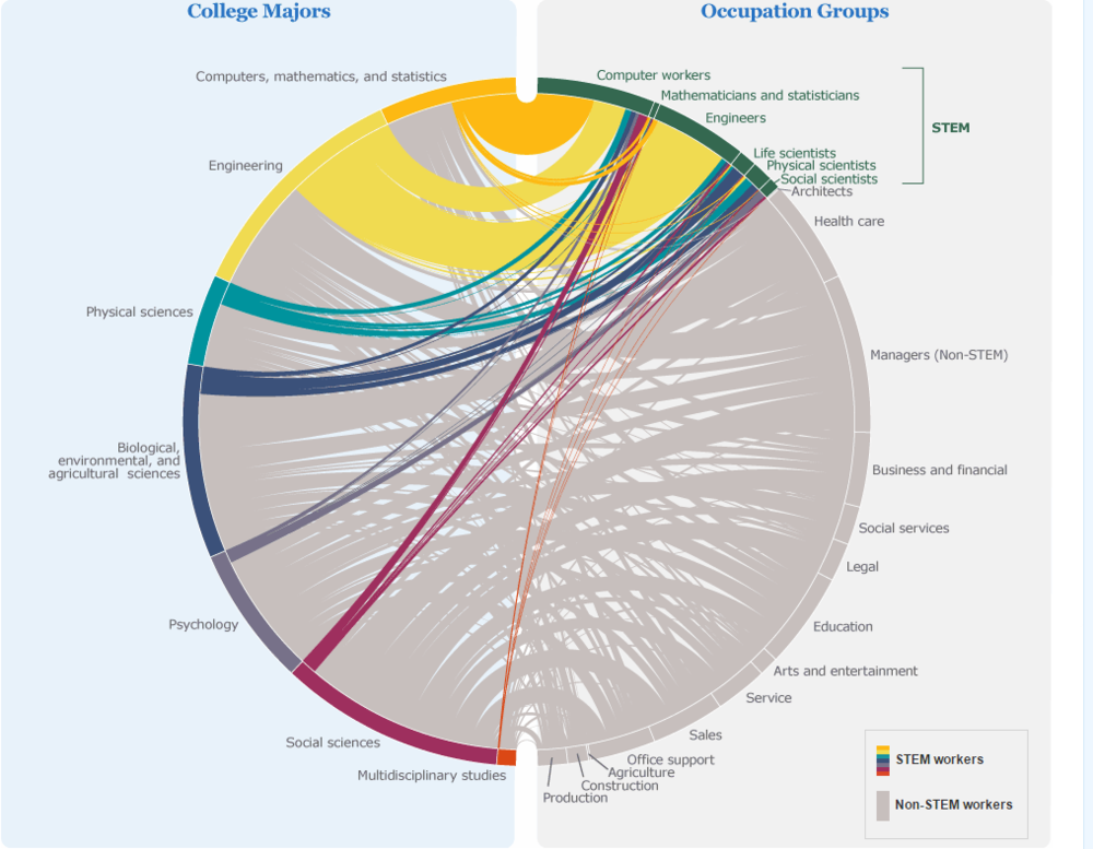
Q: What is wrong with this data visualization?

A Data Visualization Framework

The DataViz framework

1. Insights needed

Q1: What insight do I want to gain/communicate with this visualization?

  • Distribution?
  • Composition?
  • Cluster?
  • Trends (over time)?
  • Position in space?
  • Correlation, relationships?
  • Statistical properties?

2. Data Scales

Different scales….

  • … allow to ask different questions
  • … require different means of presentation

3. Analysis type

Often, we do not only look at raw data, but aim at visualizing result of an analysis. Again, different analysis offer/require different forms of visualization.

  • When: Temporal Analysis / Timeseries
  • Where: Geospatial Analysis
  • What: Topical Data Analysis
  • Why: Inferential Statistics
  • With whom: Network Analysis

4. Visualization: Types

4. Reference System

  • Often, the position in 2-dimensional space represent the first ways to map information in th data.
  • We refer to this 2d mapping as the choice of reference system.

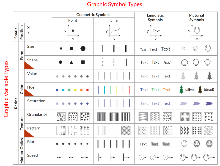
5. Graphic Symbols

The shape of elements plotted in the reference system represent another dimension to communicate (discrete) data properties. Eg.

  • Points
  • Lines
  • Linguistic symbols

6. Graphic variables

Graphical variables allow further dimensions to communicate (discrete or contineous) data properties

Symbols & variables combined

In combinations, shapes and variable mappings allow for multiple types of information expressed jointly.

7. Interactions

Interactive visualizations allow for:

  • communicating more dynamic and complex properties/relationships
  • Allow own insight-creation by exploration

Summary

The combination of…

  • … graphical symbols …
  • … other graphical variables …
  • … on a reference system…

… allow us to represent a multitude of information to be found in the data or as result of an analysis visually.

Examples: Visualizing Variables & Relationships

Summaries of One Variable: Continuous

Histogram for binned bars

Reference system:

  • x = Variable value
  • y = Observation count
  • Symbol = Bar

Summaries of One Variable: Continuous

Alternative: Probability density function (PDF)

Reference system:

  • x = Variable value
  • y = Observation count
  • Symbol = Line

Summaries of One Variable: Discrete

Barplot

Reference system:

  • x = Variable category
  • y = Observation count
  • Symbol = Bar

Summaries of One Variable: Discrete

Barplot (stacked)

Reference system:

  • y = Observation count
  • Symbol = Bar
  • Variable = Color

Summaries of One Variable: Discrete

Pie Chart

Reference system:

  • y = Observation count
  • Symbol = Bar (polar coordinates)
  • Variable = Color

Summarizing multiple variables jointly

Scatterplot (2 variables)

Reference system:

  • y = Value Variable y
  • x = Value variable x
  • Symbol = Point

Summarizing multiple variables jointly

Scatterplot (3 variables, 2c1d)

Reference system:

  • y = Value Variable y
  • x = Value variable x
  • Symbol = Point
  • Variable: Color (Species)

Summarizing multiple variables jointly

Scatterplot (3 variables, 3c)

Reference system:

  • y = Value Variable y
  • x = Value variable x
  • Symbol = Point
  • Variable: Color (Petal.Lenght)

Summarizing multiple variables jointly

Scatterplot (4 variables, 3c,1d)

Reference system:

  • y = Value Variable y
  • x = Value variable x
  • Symbol = Point
  • Variable: Color (Petal.Lenght), Shape (Species)

Summarizing multiple variables jointly

Facet Matrix (4 variables, 2c,1d)

Reference system:

  • y = Value Variable y
  • x = Value variable x
  • Y-Facet: Species

Statistical properties

Boxplot (Univariate distribution of multiple variables)

Reference system:

  • y = Value Variable
  • x = Value variable x
  • Symbol = Confidence Interval Box

Statistical properties

Correlation Matrix (bivariate distribution of multiple variables)

Reference system:

  • y = Variable
  • x = Variable
  • Variable: Color (Correlation)

Statistical properties

Correlation Matrix (bivariate distribution of multiple variables)

Interactions

Examples ar manifold. Just to give you one:

Summary

What we learned today

  • Data visualization is of high importance for data exploration, insight generation & communication
  • Depending on the purpose of th visualization, different types have to be chosen.
  • Variable characteristics influence the possibilities of visual mapping.
  • Depending on type & amount of relationships to be depicted, different visualization devices can b utulized.
  • Common mapping elements are: Reference position (x, y), color, shape, alpha, facet